I know. I updated it already but didn't uploaded it yet.
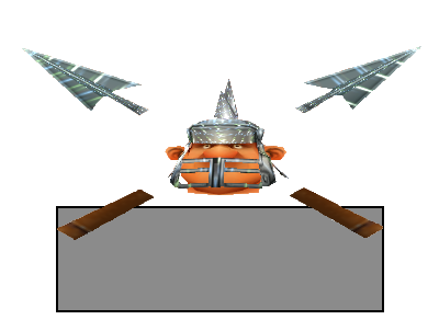
Now imagine overylaying this on any game screenshot
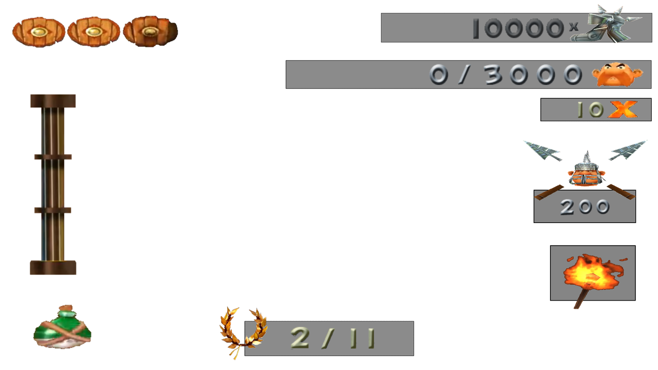
alright. this is what i have so far.
Mmmh, this is what I feared. The transparent part of the boxes are too grey, they are actually black and transparent, but when picking a color on a screenshot it may feel a bit grey. But everything else looks fine!
Altough, I just noticed: the overworld laurel isn't nearly as bright as the one on the HUD for some reason.
this will be the last time i worked on this HUD. it's too stressful for me.
Don't worry, i can take it from here ^w^
I think it is! But relax~
I'll try myself on getting all of those icons like I did the laurel ^^
i have no idea why i'm in such a rush today.
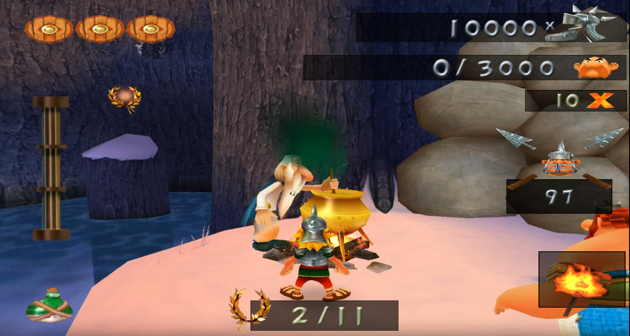
Relax and let me work on this~ I actually want to see what it would look like if we had a true 16:9 screen
 GeneralXXLXXL 2XXL 3Olympic GamesXXL SpeedrunningXXL Romastered SpeedrunningXXL 2 SpeedrunningXXL 2 Remaster SpeedrunningOlympic Games SpeedrunningRecent StratsOther Asterix GamesOther GamesAsterix MediaSpoofy GoofsCreative ShackVideosHelpBot SpamRetro GamesModdingStreamsPatchesModsToolsResourcesDownloadsWikiUnfair XXLCaesar's ChallengeIntroductionsVC TextAnnouncementsVillage GatesRulesFeedback ☰